


0
 Roller blinds
 Double roller blinds
 Roman blinds
 Venetian blinds
 Vertical blinds
 Panel blinds
 Order Free Samples
 Spare Parts
 How To Guides
 Book A Design Consultation
 Inspiration
 Upload Your Plans
 Curtains
 Double curtains
 Design PVC plantation shutters
 Design Australian PVC plantation shutters
 Design motorised roller blinds
 Design motorised curtains
 Success Stories
 Blogs
Blogs FAQ
FAQ

How to Choose a Blind Colour: Match the Frame, the Wall or the Floor?
Colour is the decision people agonise over longest and it's the one with the simplest fix: a free swatch taped to the actual window. But it helps to know what you're looking for when the swatch arrives, because blind colour behaves differently from paint — it's lit from behind for half the day. Here's how to think about it, using rooms we've actually fitted.
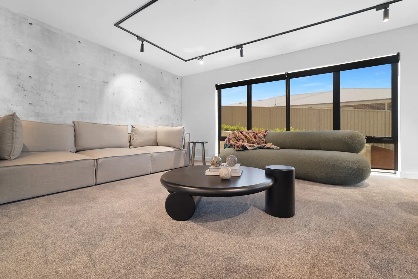
Charcoal sunscreen rollers against concrete and white. The dark fabric picks up the black window frames and disappears into the view rather than sitting on top of it.
The three things you can match
| Match to… | Effect | When it works |
|---|---|---|
| The wall | The blind disappears; the window reads as a clean rectangle of light | White or pale walls with a white, ivory or stone blind — the default in most new homes, and hard to get wrong |
| The window frame | The blind reads as part of the joinery | Black or dark frames with a charcoal or black fabric; timber frames with a warm taupe or oat. This is the "designed" look |
| The floor or furniture | The blind becomes a deliberate colour element | A warm grey to pick up a carpet, an oat linen-look to sit with timber floors. Riskier; test the swatch against both |
What almost never works is matching the blind to an accent — a cushion, an artwork — because accents change and blinds don't. Pick from the fixed things in the room.
How pale and dark fabrics behave
This is the part paint charts don't prepare you for. A blind is back-lit by the window, so its colour shifts through the day.
- Pale blockouts stay pale but glow at the edges where light bends around the fabric. In a bedroom that has to be dark, that glow reads as a bright outline. Same opacity as a dark fabric; brighter room (see the real examples).
- Dark blockouts show almost no edge glow and read darker for the same fit. They also make a small window look like a deliberate dark panel on the wall — which is either the point or a problem.
- Pale sunscreens reflect more heat (the summer heat guide has the detail) and look soft from inside, but the weave lights up and the view through them goes hazy.
- Dark sunscreens are easier to see out through — the dark mesh drops away against a bright garden — and they cut glare harder. Charcoal is the sunscreen colour most people end up with for exactly this reason.
- Light-filtering fabrics take on the colour of the light: a warm-white weave looks cream at sunset and grey on an overcast day.
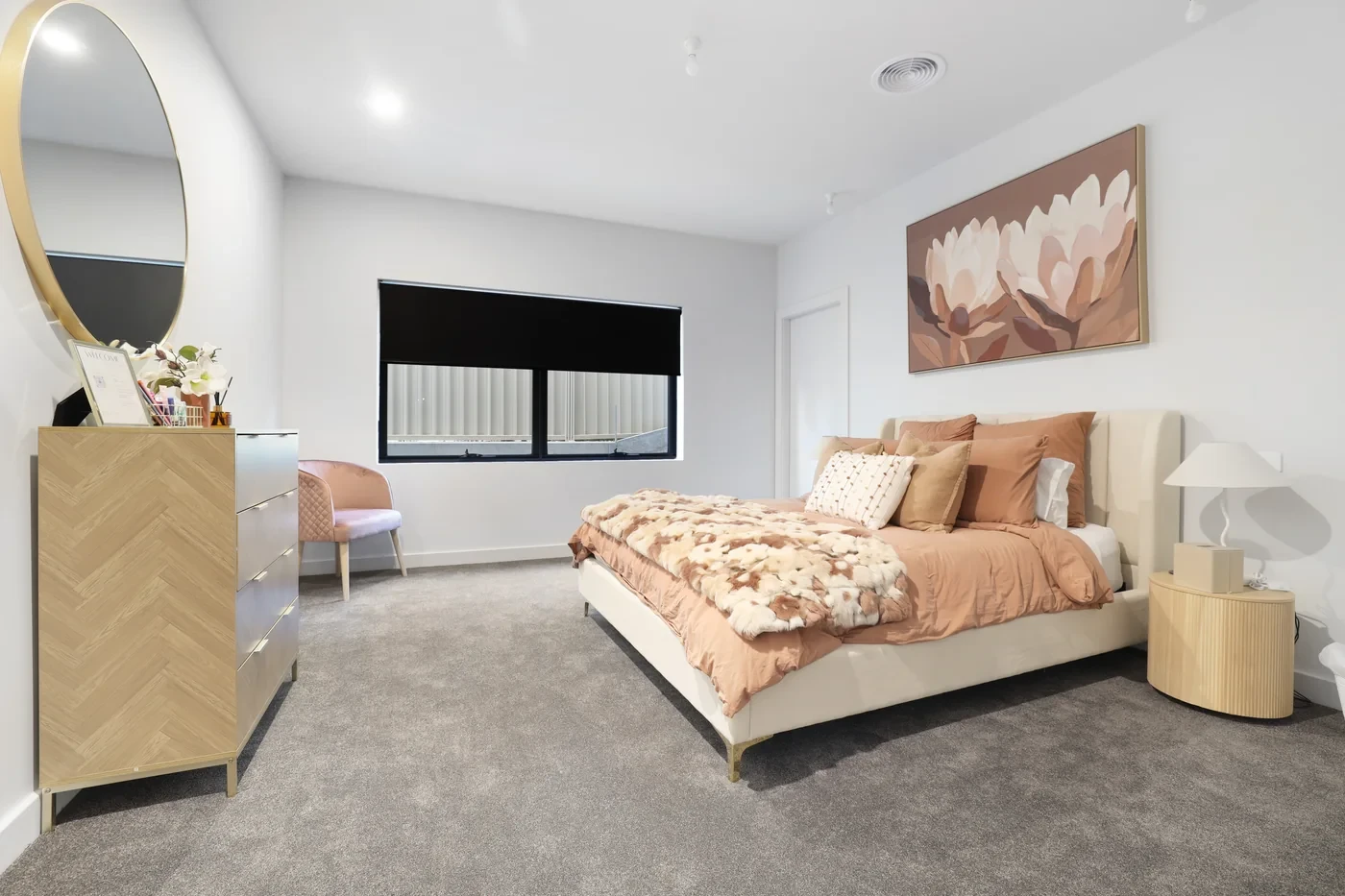
A black blockout roller on a white wall, matched to the black window frame. Up, it's a slim dark line; down, it's the darkest a bedroom gets.
Room by room
| Room | Sensible default | Why |
|---|---|---|
| Bedroom | Mid-to-dark blockout in the frame colour, or a pale one matched to the wall with a pelmet | Dark for less edge glow; pale if the room has to feel light by day — the pelmet closes the top gap either way |
| Living room | Charcoal or dark grey sunscreen | Clearest view out, hardest on glare, reads with black frames |
| Kitchen | Pale or mid sunscreen, or light-filter in the splashback's tone | Bright by day, wipes clean, doesn't fight the joinery |
| Bathroom | White or soft grey venetian or shutter | Disappears against tiles; light bounces off it |
| Home office | Charcoal sunscreen | Glare off the screen without a dark room |
| Kids' rooms | Mid-tone blockout — grey, oat, a muted colour | Dark enough for sleeps, forgiving of marks, doesn't date the way a bright print does |
| Sheer over roller | Warm-white or oat sheer; roller one step warmer in the same family | A cool roller behind a warm sheer fights; same family reads as one decision — see the layered look |
A note on bold colours and prints
You can, and some rooms suit it — a deep green blockout in a study, a rust light-filter in a kids' room. Two cautions. Blinds last a decade and the accent trend won't, so put the colour in the fabric you'll be happy to live behind in 2035, not the one that's everywhere this year. And a strong colour in a blockout will tint the light in the room when it's half down, which is lovely in the right room and jarring in a kitchen.
How to actually decide
- Order two or three free samples in the same fabric family — say a white, a stone and a charcoal sunscreen.
- Tape them to the window, not the wall. Look at them mid-morning, at 4 pm and after dark with the lights on.
- For sunscreens, look through them — the view matters more than the colour you see from the couch.
- For blockouts, look at the edges — hold the swatch flat against the glass and see how much it glows.
- Then check it against the frame and the wall in the same light. Whichever one stops you noticing the blind is usually the right one. Then the roller blinds buying guide takes you through fit and options.
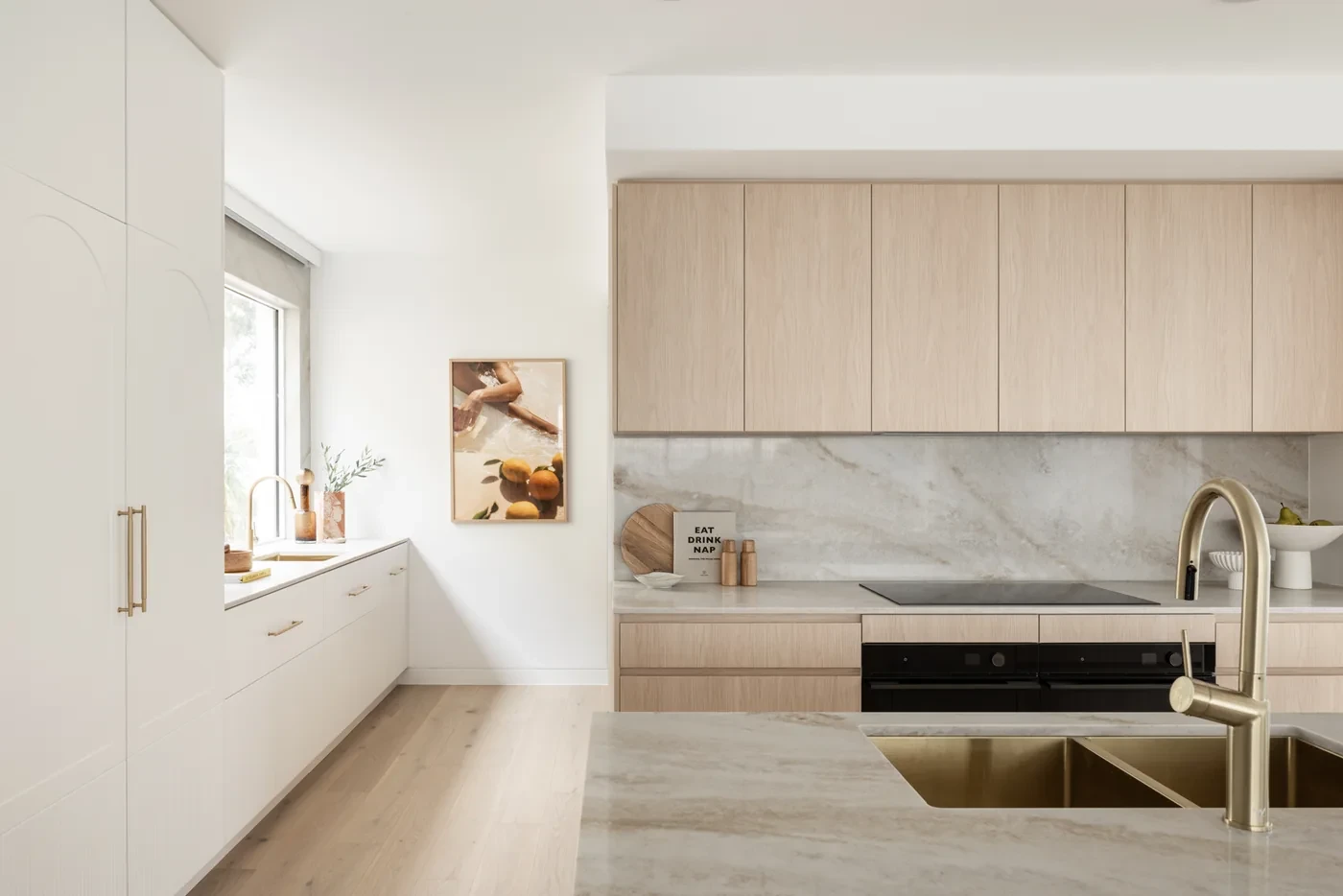
A greige sunscreen in a HAAUS kitchen, sitting between the white joinery and the stone benchtop. Neither wall-white nor frame-black; matched to the room's middle tone.
Common questions
Should blinds be lighter or darker than the walls?
Either works; it depends on what you want the blind to do. Matched to the wall, it disappears. Darker, matched to the frame, it reads as joinery. Darker than both, it becomes a feature.
Should blinds match the window frame?
It's the safest "designed" look, especially with black frames and a charcoal fabric. White frames and white blinds is the same idea and the most common result.
Are dark or light blinds better for keeping heat out?
A pale fabric reflects more heat, but with a sunscreen you trade view for it. Most of our blockouts have a pale backing on the window side whatever colour faces the room — check the back of the swatch — so with blockout you can usually pick the colour you like.
Do white blinds go yellow?
Modern coated and screen fabrics are made to hold their colour, and a fabric defect inside the five-year warranty is covered. Keep them away from harsh cleaning products, which is what usually discolours a white blind.
Should all the blinds in a house be the same colour?
The same colour on the outside-facing side keeps the facade tidy, and many people match every room to the frames for that reason. Inside, rooms can differ — as long as each room's blind matches something fixed in that room.
Order free samples
Two or three colours per window is plenty. Then build the blind in the configurator, or see the colours in real homes in the inspiration gallery.
You may also like

You may also like
Subscribe for new fabrics and install tips.
One email a month: new fabrics, install tips, the occasional honest before/after.
No spam, no daily-deal noise.

It’s never too early to consider window furnishings when you’re planning on renovating or building. Our expert team of design consultants can help create unique solutions and seamless designs and even quote directly off your house plans.





More Info
InspirationAbout UsContact UsOur ArticlesSuccess StoriesPerfect Fit GuaranteeDelivery InformationCustomer ReviewsFrequently Asked QuestionsGet in Touch
Address: 16 Bradwardine Road, Robin Hill NSW 2795
Email: hello@homeblindsaustralia.com.au
Phone: 1300 195 797
More Info
InspirationAbout UsContact UsOur ArticlesSuccess StoriesPerfect Fit GuaranteeShipping & Return PolicyCustomer ReviewsFrequently Asked QuestionsGet in Touch
Address: 16 Bradwardine Road, Robin Hill NSW 2795
Email: hello@homeblindsaustralia.com.au
Phone: 1300 195 797
© Copyright Home Blinds Australia 2026. All Rights Reserved.
Payments Accepted:
